A Canon recipe is a saved combination of in-camera settings that gives your JPEGs a consistent look straight out of the camera. Instead of editing every photo later, you set the camera once and shoot. The base of every Canon recipe is the Picture Style, which controls how the camera renders colour, contrast and sharpness.
On top of the Picture Style, a recipe adjusts sharpness, clarity, contrast, saturation, colour tone, white balance and a few exposure-related choices. This guide shows you how to read those settings and how to use a handful of Luma's daily Canon recipes as starting points.
Start with the Picture Style
Pick your base look first, because everything else builds on it. Faithful, Neutral, Portrait, Standard and Monochrome all appear in the recipes below, and each one gives a different starting character.
Picture Style: Faithful — Faithful is the Picture Style behind several of the recipes in this guide, so it is a good one to learn first.
The base look: how the camera renders colour, contrast and sharpness. On the EOS R6 Mark III, R6 V and R50 V a Color filter can be chosen here instead. It replaces the Picture Style, and the camera lists no Sharpness, Contrast, Saturation or Color tone for it, so those and Filter / Toning effect are hidden here.
Some newer looks, such as the Story and Tasty styles, are limited to the EOS R6 Mark III, EOS R6 V and EOS R50 V. If you shoot another body, stay with the standard styles and you will be fine.
Set white balance on purpose
White balance tells the camera what colour of light to treat as neutral. Auto usually works, but a fixed preset or a Kelvin value keeps colour consistent from frame to frame, which is the whole point of a recipe. A lower Kelvin value renders cooler and bluer, and a higher one renders warmer.
White balance: Cloudy — Several recipes here use the Cloudy white balance preset to keep colour steady in soft, overcast light.
Tells the camera what colour of light to treat as neutral, so whites look white. Auto usually gets it right; a preset for the light source, or a Kelvin colour temperature (2500–10000K), keeps the colour consistent.
The WB shift then works like a colour-compensating filter on top. On the blue to amber axis, lower values move toward blue and higher values toward amber. On the magenta to green axis, lower values move toward magenta and higher values toward green.
Tune sharpness, clarity and contrast
Canon splits sharpness into three controls. Strength sets how strongly outlines are emphasised. Fineness sets how thin the emphasised edges are, where a low number is fine and a high number is grainy. Threshold sets how much contrast an edge needs before sharpening applies, where a low number emphasises even faint edges but can make noise more noticeable.
Clarity is separate. A lower value gives a softer look and a higher one a sharper look. Contrast is the difference between light and dark tones, so lower values flatten the picture and higher values add punch. Saturation controls how strong colours look, and Color tone shifts skin tones: lower values are redder and higher values are more yellow.
Recipes to try
These daily recipes cover a range of moods. Load one, shoot a few frames in the light it was made for, and then nudge a single setting at a time.
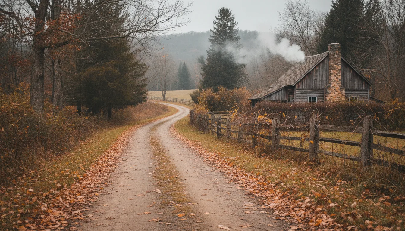
Pewter-soft and muted, Smoke Chimney Backroads pairs Faithful with lowered clarity, contrast and saturation. It suits quiet country roads and flat autumn light, and it is a gentle first recipe to try.
Amber Grit Dispatch pushes the opposite way, with stronger sharpness and added contrast and saturation on a Faithful base. Choose it when you want a gritty, documentary feel.
Tangerine Canopy Portraits uses the Portrait style with raised saturation and clarity and a warm amber white balance shift. It is a good fit for people shots under autumn foliage.
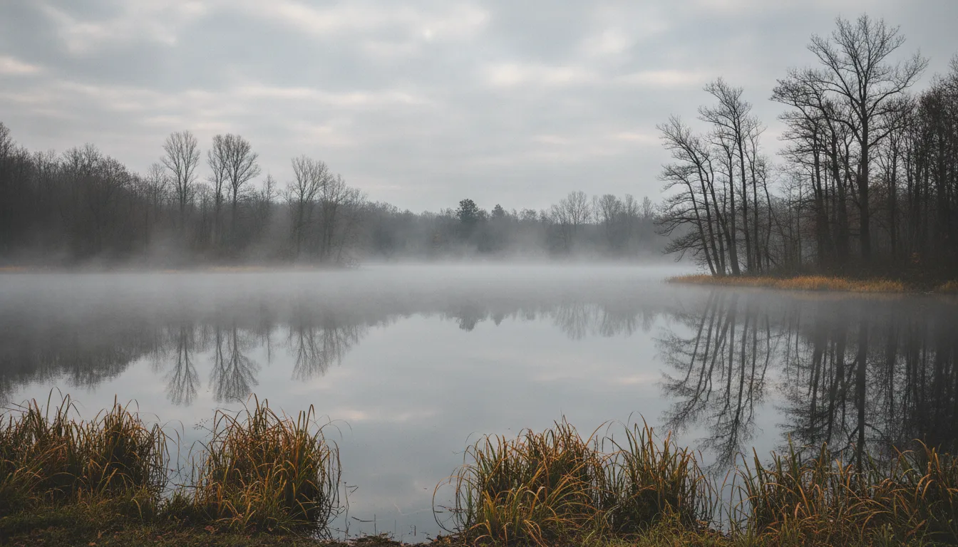
Pewter Lake Veil is a Monochrome recipe with a Green filter effect and low clarity. Try it for misty water and soft, moody black and white.
Compare recipes side by side
The table below lines up three of the recipes so you can see how little changes make a big difference. Look at the contrast, saturation and white balance rows first, since they shape the mood the most.
Most of these recipes turn on Highlight tone priority, which reduces overexposed, clipped highlights. It works on top of any Picture Style. Keep in mind that it limits the lowest ISO you can use and noise may increase slightly.
Highlight tone priority: Enable — Enable is the Highlight tone priority value used by most recipes in this guide.
Reduces overexposed, clipped highlights. A shooting-menu setting, so it applies on top of any Picture Style or Color filter. With Enable or Enhanced the ISO range starts at ISO 200, and noise may increase slightly.
A simple way to adapt any recipe
Change one setting at a time and shoot the same scene again. If skin looks too red, raise Color tone. If the picture feels too busy, lower Clarity or Sharpness strength. If it feels too bright, use a lower exposure compensation. Small, single steps teach you what each control does.
If you also shoot other brands, our guides for Nikon and Sony cover the same idea with their own menus.

 AI reference frame
Canon · 2026-11-14