Nikon Recipes: How to Build and Use Picture Control Looks
2026-11-15
What a Nikon recipe really is
A Nikon recipe is a saved combination of settings that gives your photos a consistent look straight out of the camera. Instead of editing every file, you pick a base look, tune a few adjustments, and shoot. This guide shows you how to read a recipe, how each setting changes your picture, and which of Luma's daily recipes suit different kinds of scenes.
Start with the Picture Control
Everything begins with the Picture Control, the base look that decides how your camera processes colour, tone and sharpness. Pick the base first, because every other adjustment is built on top of it.
Picture Control: Neutral — Neutral is a sensible base when you want a restrained look that you can push with sharpening and contrast.
The base look: how the camera processes colour, tone and sharpness. Its adjustments (Sharpening, Mid-range sharpening, Clarity, Contrast, Saturation, Brightness, Hue) move in steps of 0.25. Flat Monochrome, Deep Tone Monochrome and Rich Tone Portrait are only on newer bodies (Z9, Z8, Z6 III, Z f, Z5 II, Z5 IIC, Z50 II, ZR).
Some looks only exist on newer bodies. Rich Tone Portrait is available on the Z9, Z8, Z6 III, Z f, Z5 II, Z5 IIC, Z50 II and ZR, so check your camera before you try a portrait recipe that uses it.
Picture Control: Rich Tone Portrait — Rich Tone Portrait is only on these newer bodies, so older cameras such as the Z6 II or Z7 II cannot use it.
The base look: how the camera processes colour, tone and sharpness. Its adjustments (Sharpening, Mid-range sharpening, Clarity, Contrast, Saturation, Brightness, Hue) move in steps of 0.25. Flat Monochrome, Deep Tone Monochrome and Rich Tone Portrait are only on newer bodies (Z9, Z8, Z6 III, Z f, Z5 II, Z5 IIC, Z50 II, ZR).
Sharpening, mid-range sharpening and Clarity
Nikon gives you three layers of sharpness. Sharpening handles fine details and outlines. Mid-range sharpening covers patterns and lines between fine detail and thicker outlines. Clarity affects overall sharpness and thick outlines without changing brightness or dynamic range. A higher value on any of them means more sharpening of that layer, and a lower value means less. All of these move in steps of 0.25, so small changes are possible.
A crisp, punchy recipe raises all three. A soft, dreamy recipe lowers Clarity and mid-range sharpening while leaving fine Sharpening alone or even high, which keeps small details readable while the broader look feels gentle.
Contrast, brightness and saturation
Contrast is the difference between light and dark tones: lower is flatter, higher is more dramatic. Brightness raises or lowers the picture without losing detail in highlights or shadows. Saturation controls how vivid colours are, with lower values giving quieter colour and higher values giving richer colour.
White balance and shift
White balance tells the camera what light to treat as neutral. A lower Kelvin value renders cooler and bluer, and a higher one renders warmer. White balance shift fine-tunes the result on two axes. Lower values lean toward amber or green, and higher values lean toward blue or magenta.
White balance: 5600K — Setting white balance to 5600K is a steady choice for daylight portraits and street scenes, and it keeps colour consistent from frame to frame.
Tells the camera what colour of light to treat as neutral, so whites look white. Auto usually gets it right; a preset for the light source, or a Kelvin colour temperature (about 2500–10000K), keeps the colour consistent.
Active D-Lighting and exposure
Active D-Lighting keeps detail in highlights and shadows in high-contrast scenes. Higher settings keep more detail at both ends but give flatter contrast, while Off leaves contrast as the Picture Control sets it. Exposure compensation makes the picture brighter or darker than the meter would.
Active D-Lighting: Off — With Active D-Lighting Off, the contrast of your chosen Picture Control comes through untouched, which suits bold slide-film looks.
Preserves detail in highlights and shadows, for pictures with natural contrast in high-contrast scenes such as bright scenery through a doorway or a shaded subject on a sunny day. A photo shooting menu setting, so it applies on top of any Picture Control. Works best with matrix metering.
Daily recipes to try
These recipes from Luma show how the settings above combine into finished looks. Each one is chosen for a different mood.
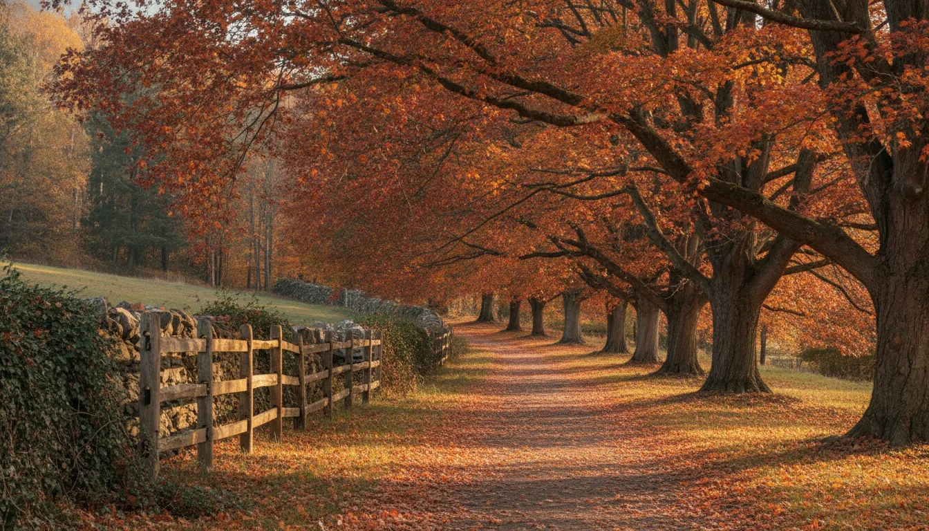
Maple Lane Slide Film builds on Vivid with raised contrast and Daylight white balance, so it suits autumn colour when you want a punchy slide-film feel.
Harvest Dusk Film Stock uses Standard with lowered contrast, softer sharpening and Cloudy white balance, which gives a gentle, muted film look for evening light.
Ember Glow Faces uses Rich Tone Portrait with warm white balance and richer saturation, so it flatters skin on the newer bodies that support it.
Compare the recipes side by side
The table below puts four recipes next to each other so you can see how a sharp, vivid recipe differs from a soft, muted one. Look at contrast, clarity and saturation first, since those three drive most of the mood.
Choose the base Picture Control, then work down the list: sharpening, mid-range sharpening, Clarity, contrast, brightness, saturation and hue. Next set white balance and the shift, then Active D-Lighting and exposure compensation. Shoot a few test frames in the light you expect, and adjust one setting at a time so you can see what each change does.
If you shoot Sony as well, our Sony guide covers the same idea on another system.

 AI reference frame
Nikon · 2026-11-15