Creative Look is Sony's in-camera picture finishing system. Instead of choosing a tone curve from a plain menu, you pick a named look — a full starting point for colour, contrast, and texture — and then fine-tune it with individual sliders. The result is baked into your JPEG or displayed on your LCD in real time, so what you see is what you get.
Creative Look is available on all current Sony bodies in the Luma app: the α7 V, α7 IV, α7R VI, α7R V, α1 II, α1, α9 III, α7S III, α7C II, α7CR, α6700, ZV-E1, and ZV-E10 II. It is not available while a Picture Profile is selected or when shooting Log. Keep those conditions in mind and Creative Look will be accessible whenever you need it.
The Twelve Looks at a Glance
Sony gives you twelve named looks to build a recipe on: ST (Standard), PT (Portrait), NT (Neutral), VV (Vivid), VV2 (Vivid 2), FL (Film), FL2 (Film 2), FL3 (Film 3), IN (Instant), SH (Soft High-key), BW (Black and White), and SE (Sepia). Each one starts with a different baseline character. ST is a balanced, all-purpose foundation. PT is tuned for skin tones. NT strips back contrast and saturation so you can push adjustments further without clipping. VV and VV2 punch colours hard. FL, FL2, and FL3 mimic analogue film finishes with lifted shadows and a characteristic fade. IN gives that instant-print warmth. SH is airy and high-key. BW converts to monochrome, and SE gives a warm-toned, single-colour rendition.
Creative Look: FL2 (Film 2) — FL2 and FL3 are only available on the α7 V, α7R VI, α1 II, and α9 III — if you shoot one of those bodies, you have access to two extra analogue-flavoured looks that other cameras in the lineup do not offer.
The base look: the finish the camera gives the picture, which its adjustments then fine-tune. Creative Look is on newer bodies; the α7 III and α7R IV have the older Creative Style instead, so Luma recipes cannot be set on them. FL2 and FL3 exist only on the α7 V and α7R VI, and on the α1 II and α9 III from firmware 4.00. Creative Look is unavailable in Intelligent Auto, with a Picture Profile, or when shooting Log.
Understanding the Adjustment Sliders
Every Creative Look recipe in Luma pairs the base look with a set of adjustment values. Learning what each slider actually does is the fastest way to start customising recipes for your own shooting style.
Contrast: -2 — Pulling contrast toward a negative value reduces the difference between your bright and dark areas — useful when you want a flatter, more film-like image that retains detail in both shadows and highlights.
Accentuates the difference between light and dark. Creative Look adjustments have their own ranges; they are not the older Creative Style steps, and the numbers do not carry over.
Highlights: -4 — A negative highlights value darkens the brightest parts of the frame, helping you hold detail in skies, windows, and other bright surfaces that might otherwise blow out.
Adjusts the brightness of the bright areas. Creative Look adjustments have their own ranges; they are not the older Creative Style steps, and the numbers do not carry over.
Shadows: +3 — A positive shadows value brightens the dark areas of your image, lifting blacks and revealing detail in underexposed regions of the frame.
Adjusts the brightness of the dark areas. Creative Look adjustments have their own ranges; they are not the older Creative Style steps, and the numbers do not carry over.
Fade: 4 — Fade adds a washed-out, analogue quality to the image. A higher fade value means more of that effect — the picture looks more faded and matte.
A faded effect on the picture; 0 to 9. Creative Look adjustments have their own ranges; they are not the older Creative Style steps, and the numbers do not carry over.
Saturation: +2 — A positive saturation value makes colours more vivid and punchy. Pull it negative and colours become more restrained and muted — good for a desaturated film look.
How vivid colours are. Not available on BW or SE, where it is hidden. Creative Look adjustments have their own ranges; they are not the older Creative Style steps, and the numbers do not carry over.
Sharpness: 6 — A higher sharpness value accentuates contours more strongly, giving the image a crisper, more defined edge rendition.
How strongly contours are accentuated; 0 to 9. Creative Look adjustments have their own ranges; they are not the older Creative Style steps, and the numbers do not carry over.
Clarity: 5 — A higher clarity value increases the mid-tone contrast effect, adding texture and presence to the image without the global punch of the contrast slider.
A clarity effect on the picture; 0 to 9. Creative Look adjustments have their own ranges; they are not the older Creative Style steps, and the numbers do not carry over.
Two additional sliders shape the relationship between sharpness and subject detail. Sharpness Range controls how fine the outlines must be for Sharpness to apply to them — a higher value means sharpness is applied to finer outlines, while a lower value restricts it to coarser ones. Note that Sharpness Range is not available when you are recording video. White Balance sets the colour of light the camera treats as neutral, and White Balance Shift nudges the result further on two axes: amber toward blue, and green toward magenta.
Film Looks: The FL Family in Practice
The FL look is the workhorse of the daily recipe list right now, and for good reason. It starts with a filmic character — naturally lifted shadows, a slight warmth, and a gentle rolloff in the highlights — that holds up beautifully across landscape, portrait, and street work. Pairing it with a positive amber white balance shift and a moderate fade deepens that analogue quality without crossing into artificiality. Three recent daily recipes use FL as their base, and comparing them side by side shows how dramatically the adjustment sliders can shift the mood while keeping the same underlying look.
Bodies— α7 IV, α7R V, α7S III, α7C II, α7CR, α6700, α1, ZV-E1
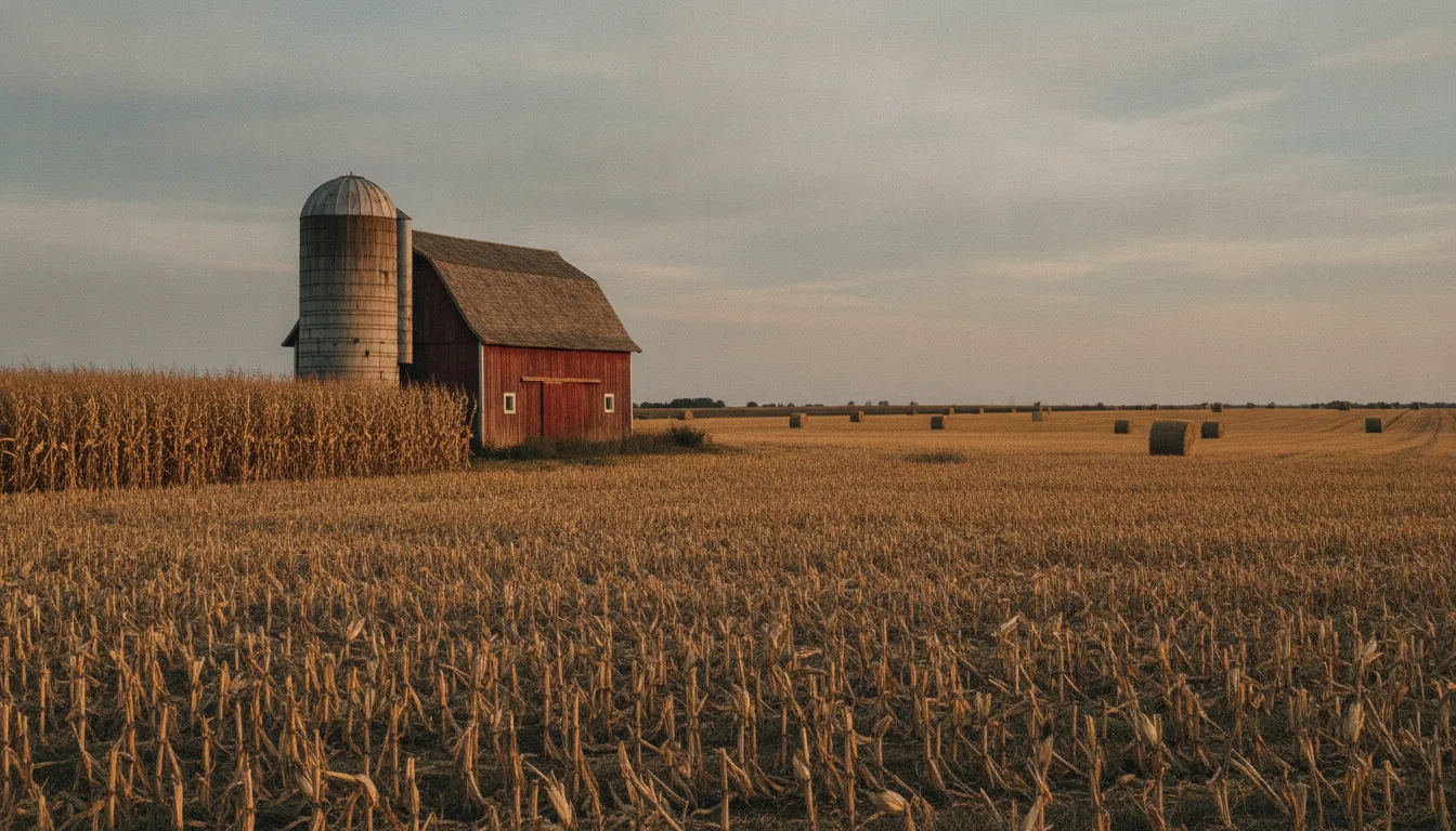
Rusted Silo Afternoon is a warm, slightly lifted FL recipe with positive saturation and a healthy amber shift in the white balance — a great starting point for golden-hour exteriors or any scene with warm, natural light.
Bodies— α7 IV, α7R V, α7S III, α7C II, α7CR, α6700, α1, α9 III, ZV-E1
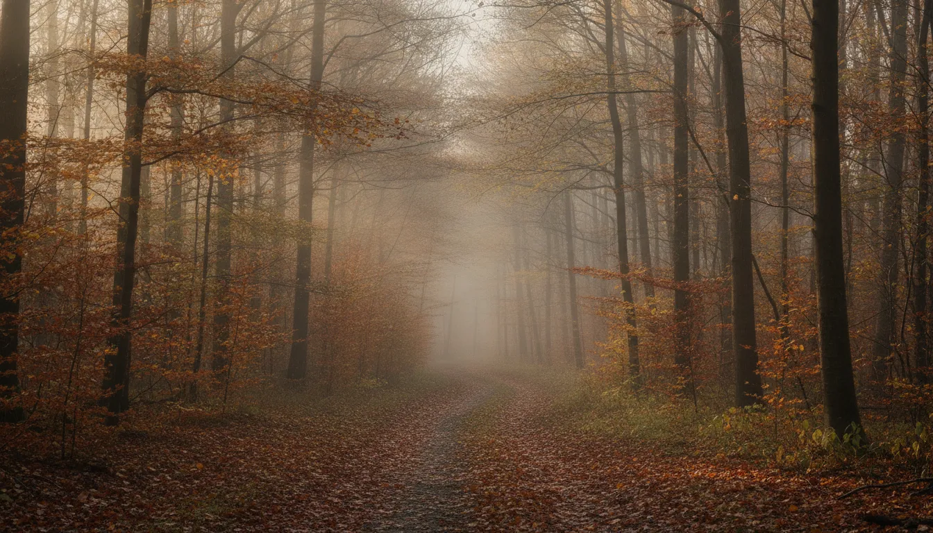
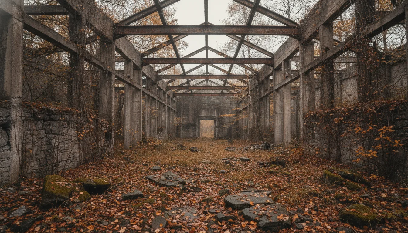
Gilded Forest Séance takes the same FL base and pulls saturation negative instead, creating a more muted, desaturated interpretation that suits moody woodland or overcast scenes where you want colour to recede rather than sing.
Bodies— α7 IV, α7R V, α7S III, α7C II, α7CR, α6700, α1, ZV-E1
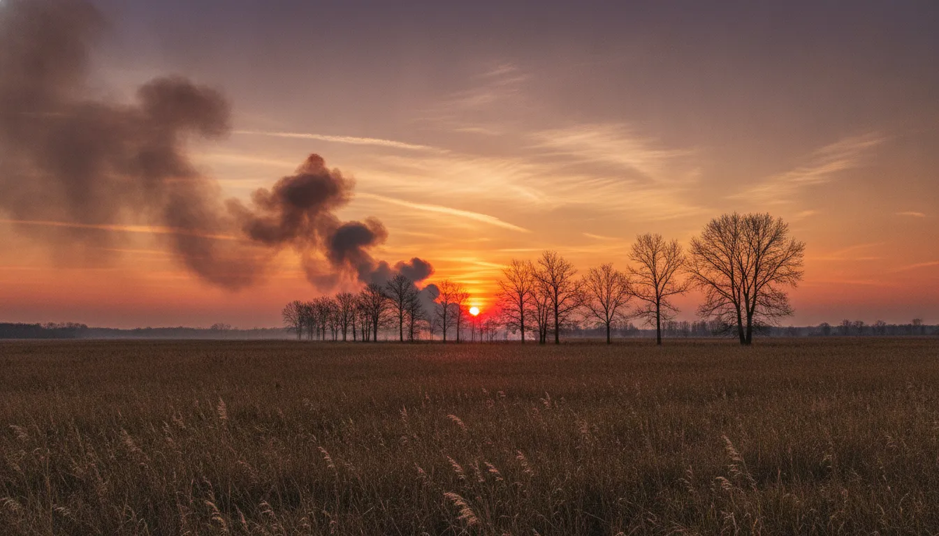
Bonfire Smoke Dusk is another FL recipe tuned for warm, low-light situations — the pushed highlights recovery and generous fade give it an atmospheric, end-of-day quality that suits dusk, candlelight, or fire-lit scenes.
If the FL family is about restraint and atmosphere, VV2 is about presence. The Vivid 2 look pushes colour more aggressively than VV, making it a natural choice for landscapes, foliage, and any scene where saturated colour is part of the story. It still responds well to highlight recovery and shadow lifting, so you do not have to sacrifice tonal range just to get rich colour.
Bodies— α7 IV, α7R V, α7S III, α7C II, α7CR, α6700, α1, ZV-E1
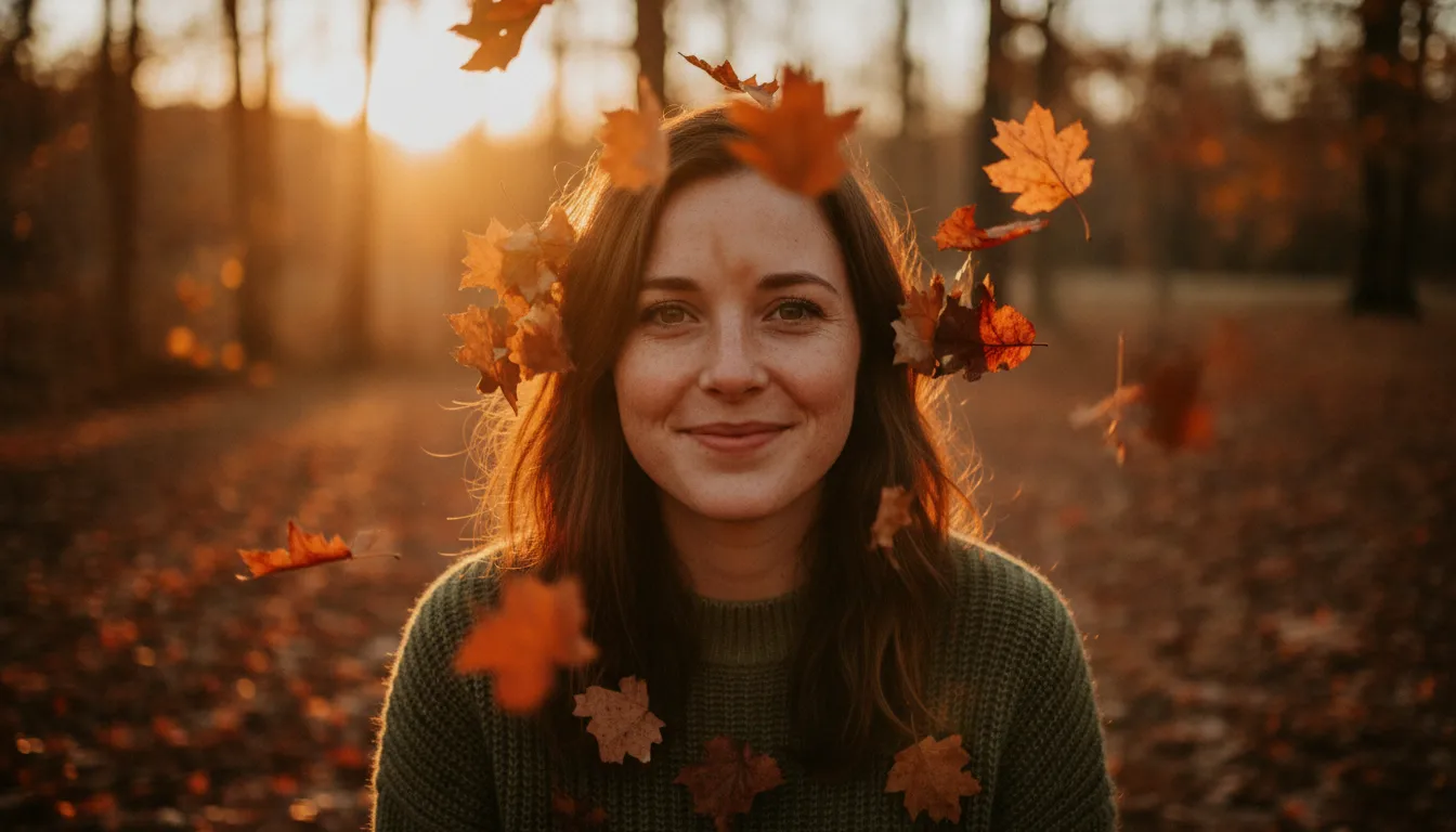
Broadleaf Chromatic Witness pairs VV2 with high saturation and a positive shadows value to create a lush, colour-rich look that is ideal for autumn foliage, tropical greenery, or any scene with bold natural colour.
Bodies— α7 IV, α7 V, α7R V, α7R VI, α1, α1 II, α9 III, α7S III, α7C II, α7CR, α6700, ZV-E1
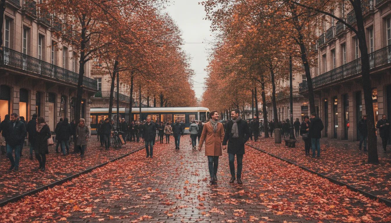
Tawny Twilight Face uses VV2 with negative saturation and a generous shadow lift, turning the vivid base into something more subdued and portrait-friendly — proof that VV2 is not only for saturated landscapes.
Black and White: Crafting a Monochrome Recipe
The BW look converts your image to black and white in-camera. Because colour information is gone, the sliders that remain — contrast, highlights, shadows, fade, sharpness, sharpness range, and clarity — carry all the expressive weight. A BW recipe lives or dies by how it handles tonal separation. High contrast and clarity give you the punchy, graphic look of a news photograph. Pulled highlights combined with lifted shadows and a touch of fade push you toward the softer, more romantic quality of a fine-art print.
Bodies— α7 V, α7 IV, α7R V, α7S III, α7C II, α7CR, α6700, α1, α9 III, ZV-E1
Fallen Ash Quarry is a BW recipe with elevated contrast, a strong clarity value, and pushed sharpness — built for dramatic, high-definition monochrome work in industrial or textural subjects where every surface counts.
How to Build Your Own Recipe
Starting from a daily recipe in Luma is the fastest route to a working look. Load a recipe onto your camera, shoot a subject you know well, and then adjust one slider at a time. Start with the Creative Look itself — does the base character fit the scene? Then work through highlights and shadows to shape your tonal range, contrast to set the overall punch, and fade if you want that analogue softness. Saturation comes next: push it for vivid colour-led work, pull it for a muted or cinematic finish. Sharpness and clarity are finishing touches that affect perceived detail and texture without changing colour or exposure.
White balance is often underused in recipe building. Fixing it to a Kelvin value rather than leaving it on Auto gives you consistent, repeatable colour from shot to shot — essential if you are building a look for a specific type of light. A cooler temperature makes the image feel crisper and more northern; a warmer one wraps the scene in golden or amber tones. The white balance shift axes give you even finer control: shifting toward amber warms the image further, while shifting toward blue cools it. Shifting toward magenta adds a filmic warmth to skin, while shifting toward green can counteract artificial lighting casts.
Exposure compensation is part of a recipe too. Many of the daily recipes use a small positive or negative value to tilt the overall brightness slightly away from the metered exposure. A negative value darkens the image and can help the look feel more dramatic or moody; a positive value opens the frame up and suits airy, bright, or high-key subjects. Because it works with Auto ISO, you can combine it with your chosen ISO range to control both brightness and noise characteristics at once.
Once you have dialled in a look you are happy with, save it in Luma so you can recall it instantly on your next shoot. Over time you will build a small library of recipes tuned to the kinds of light and subjects you return to most often — portraits in shade, street scenes at dusk, landscapes in flat midday light — and switching between them becomes as quick as changing a preset in any other tool. That is exactly what the daily recipes in Luma are designed to inspire: a starting point that gets you close, with every slider right there in front of you to take it the rest of the way.
Written by Luma from its daily recipe archive and checked against camera data.

 AI reference frame
Sony · 2026-11-05